Colorblind Simulator
Upload an image and see how it looks to people with different types of color vision deficiency. Red-green deficiency alone is commonly estimated at about 1 in 12 men and 1 in 200 women of Northern European ancestry — is your design still readable?
Drop an image here
or click to browse · paste from clipboard (Ctrl+V)
Protanopia, deuteranopia, and tritanopia use the Machado et al. (2009) model; achromatopsia is a luminance grayscale. The image is processed in your browser and is not uploaded.
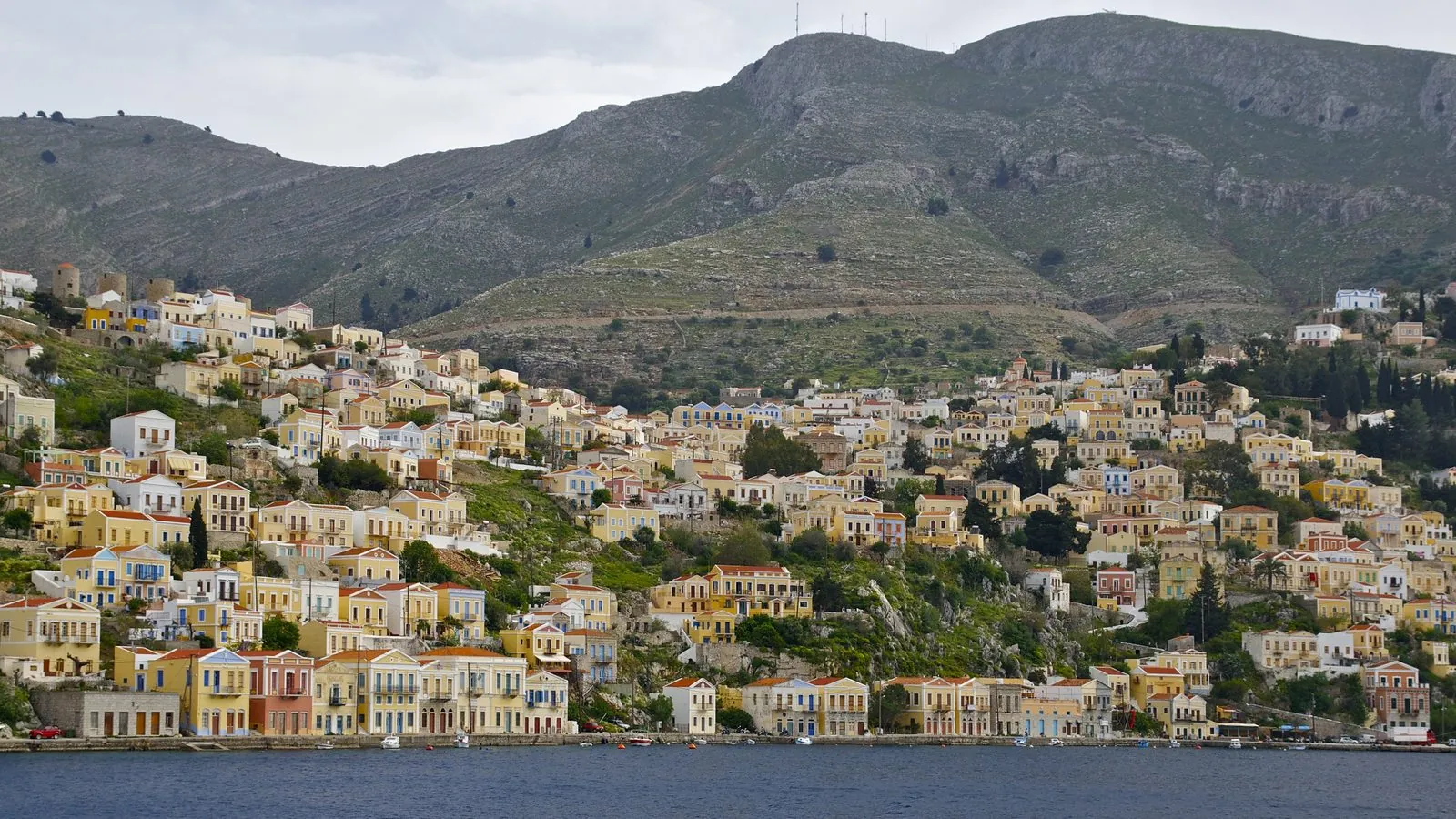
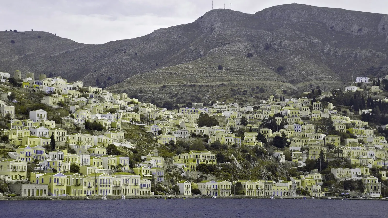
The same frame, two ways of seeing
The candy-colored houses of a Greek harbor town, with a deuteranopia preview prepared ahead of time. It differs somewhat from this tool’s output for the same photo, most visibly in saturated areas.
Original · normal vision
Deuteranopia · no green cones
What happens to each pixel
The simulator scales the image so its longest side is at most 1,200 pixels, converts each pixel from sRGB to linear light, and multiplies it by a 3 × 3 matrix: the severity-1.0 matrices from Machado et al. (2009) for protanopia, deuteranopia, and tritanopia. The achromatopsia view instead sets all three channels to the pixel’s relative luminance, 0.2126 R + 0.7152 G + 0.0722 B, the same weights the Contrast Checker uses. Out-of-range results are clipped, converted back to sRGB, and rounded; transparency is kept.
Red and green status dots
#B83A3A / #3E8248ΔE 24.3#5D5639 / #847844ΔE 12.3#7C7136 / #7A714CΔE 2.6#CA163B / #327F74ΔE 28.1#676767 / #747474ΔE 4.5Blue and green map colors
#2E7EA5 / #3C9077ΔE 10.3#6B7DA7 / #8C8776ΔE 9.8#5B71A4 / #807E79ΔE 10.0#00888B / #089189ΔE 2.9#767676 / #828282ΔE 4.1Both pairs come from our color blindness guide. ΔE is the distance between the two colors in OKLab, the space behind the OKLCH values in the Code Converter, scaled so black to white is 100. The status dots nearly merge under deuteranopia. The blue and green pair keeps its gap in both red-green views and merges under tritanopia. Neither pair reaches 1.7:1 contrast in any view, so lightness alone separates them poorly.
Matrix rows sum to 1, so neutral grays such as #808080 come through unchanged. To reproduce the rows, load a PNG without a color profile containing flat blocks of the four original colors, download the panels, and read them with the Image Color Picker.
What the simulation can and cannot tell you
Each view approximates the complete form of one deficiency. It detects colors that collide; it does not show what a particular person sees.
- Full severity only. There is no severity slider, and the milder anomalous forms (protanomaly, deuteranomaly, tritanomaly) are not simulated, so for many viewers the panels exaggerate the change.
- Grayscale does not stand in for the other views. Pure red
#FF0000and dark green#226600stay apart in the achromatopsia view (ΔE 13.6) but become#6D5F00and#695C00under protanopia (ΔE 1.2). - Contrast can move either way. Protanopia darkens red: red on black falls from 5.25:1 to 3.29:1, while red on white rises from 4.00:1 to 6.39:1. The simulator does not measure contrast, so check text pairs in the Contrast Checker.
- A scaled copy. All five panels, including Original, come from a copy scaled to at most 1,200 pixels on the longest side, so a 4,000 × 3,000 photo becomes 1,200 × 900. Download PNG saves that size with transparency kept, and an animated GIF becomes one still frame, usually the first.
- Achromatopsia is more than grayscale. That view removes color only, not the reduced sharpness and light sensitivity associated with the condition.
- Files and screens shift colors. The math assumes sRGB, so wide-gamut colors can be clipped when the browser draws the image, and your display’s calibration and night-mode settings change every panel, including the original.
- Not a vision test. These panels cannot tell you whether you or anyone else has a color vision deficiency.
What is a colorblind simulator?
A colorblind simulator transforms an image to approximate how it appears to someone with color vision deficiency (CVD). Commonly cited estimates put inherited red-green deficiency at roughly 1 in 12 men and 1 in 200 women of Northern European ancestry, with rates varying between populations. If your chart, map, game, or interface uses color as the only signal, a meaningful share of your audience may not see the difference. This tool shows an approximation of the strongest form of each deficiency, side by side with the original.
Four deficiency types
Protanopia, deuteranopia, tritanopia, and full achromatopsia — the complete dichromatic set plus total color blindness.
Published model
The three dichromacy views use the Machado et al. (2009) matrices at full severity, applied in linear RGB. The achromatopsia view is a luminance grayscale.
Two viewing modes
Compare all five versions in a grid, or switch to full-width view. Click any panel to enlarge it; click anywhere or press Esc to close.
Local & downloadable
Processing happens in your browser, and the tool uploads nothing. Download any panel as a PNG, at the processed size of up to 1,200 pixels on the longest side.
Test your design in three steps
-
Upload an image
A screenshot of your UI, a data chart, a map, a poster — anything where color carries meaning.
-
Compare the versions
Scan the grid for places where two different colors collapse into one. Switch to full width for a closer look.
-
Fix and re-test
Where colors merge, add a second cue — labels, patterns, icons, or a bigger lightness difference — and run it again.
Designing so the simulation stops scaring you
You can't fix color vision — you can stop depending on it. The patterns that survive every simulation:
- Never encode meaning in hue alone. Red/green status dots become nearly identical under deuteranopia. Pair every color signal with a second channel: an icon, a label, a shape, a pattern.
- Separate by lightness, not just hue. A dark red and a light green survive simulation even when the hues collapse, because the lightness difference remains. Run your pair through the Contrast Checker: a pair that passes as text usually stays distinguishable here too, though its simulated contrast can drop.
- Charts are the danger zone. Multi-line charts with rainbow legends can be hard to read for people with red-green deficiency. Use direct labels on the lines, varied dash patterns, or a color scale that varies in lightness (like a single-hue ramp from the Shades generator).
- Test deutan first, but not only deutan. Red-green deficiencies are by far the most common, so start with those two views. Then check tritanopia too: blue-versus-green pairs can survive both red-green views and still merge there, as the example above shows.
Related tools & guides
- Contrast Checker — Pair the simulation with hard numbers — test your text colors against WCAG.
- Photo Palette Extractor — Extract a palette, then come back and see how it survives each simulation.
- Color blindness types explained — Protanopia to achromatopsia — what each type changes and how common they are.
Frequently asked questions
How accurate is the simulation?
The protanopia, deuteranopia, and tritanopia views use the Machado et al. (2009) physiologically-based model at full severity, applied in linear RGB — a widely cited model in accessibility tooling. The achromatopsia view is a luminance grayscale. Milder forms are not simulated, and individual perception varies, so treat the result as an approximation of complete dichromacy, not a medical instrument.
What's the difference between protanopia and deuteranopia?
Both make red and green hard to distinguish, but for different reasons: protanopia is the absence of red-sensitive cones (reds also look darker), while deuteranopia is the absence of green-sensitive cones. Deuteranomaly, a milder shift of the green-sensitive response, is more common than complete deuteranopia; this tool shows only the complete form.
Is my image uploaded anywhere?
No. The transformation runs pixel-by-pixel in your browser using the Canvas API, and the simulator does not upload the image or save it. Closing the tab removes it from memory. Page loads, analytics, and ads may still make separate network requests.
My design fails the test. What should I do?
Never rely on hue alone. Add a second channel: text labels, icons, patterns or dashes in charts, and larger lightness differences between adjacent colors. Then verify the lightness difference numerically with the Contrast Checker — a pair that passes 3:1 usually survives every CVD type.
Which type should I prioritize testing?
Red-green deficiencies (protanopia and deuteranopia) cover the overwhelming majority of affected users, so fix those first. Tritanopia and achromatopsia are much rarer, but still check every view: a pair can stay apart in grayscale and merge under protanopia, as pure red and dark green do in the limits section above.