Duotone Generator
Map a photo's shadows and highlights to two colors of your choice — the classic poster and album-cover look, rendered instantly in your browser.
Drop an image here
or click to browse · paste from clipboard (Ctrl+V)
One photo, two inks
This blue neon shot remapped to a midnight-and-neon pair — shadows become #1A1A2E, highlights become #E94560, and everything in between blends along the ramp.
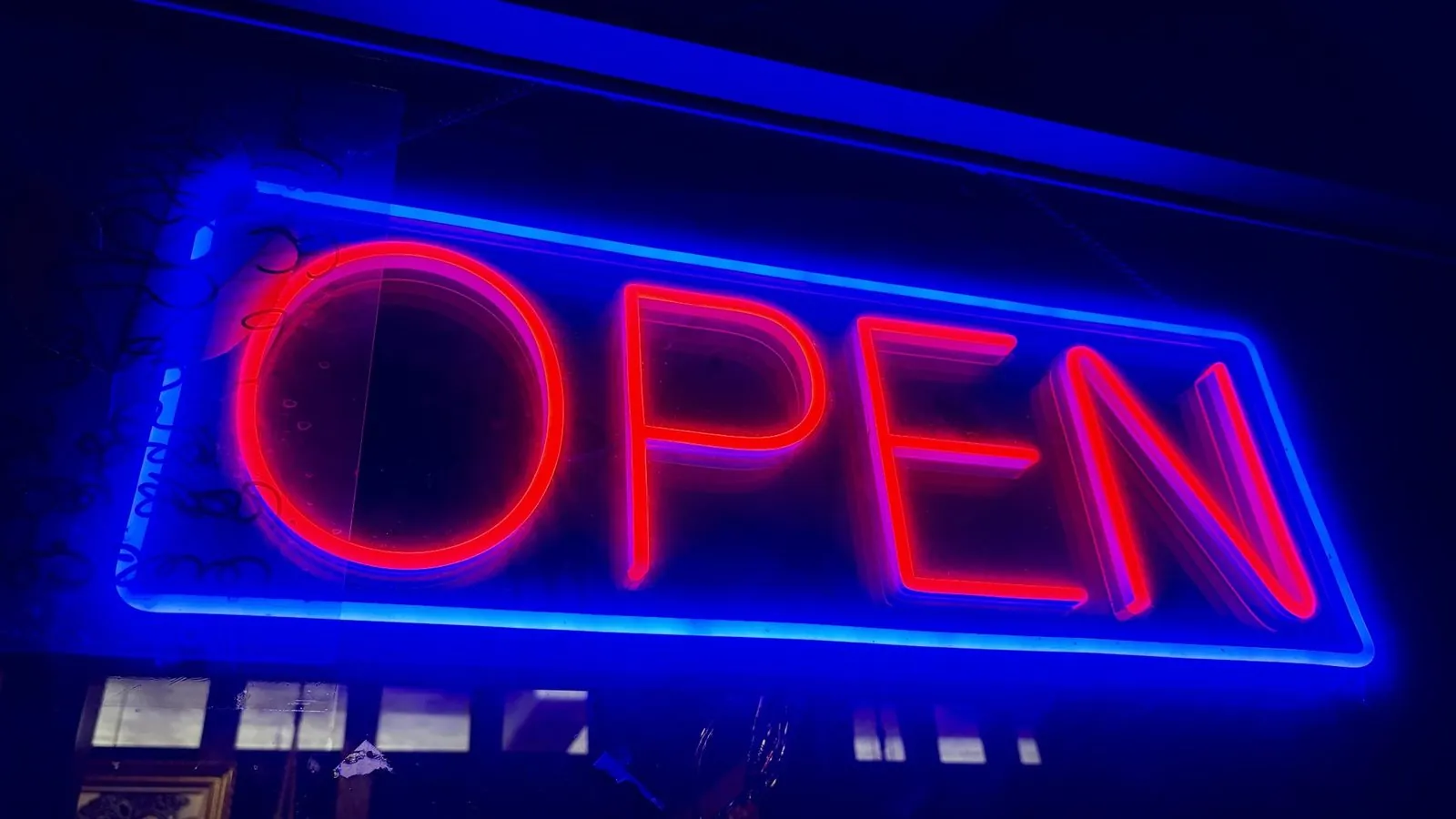
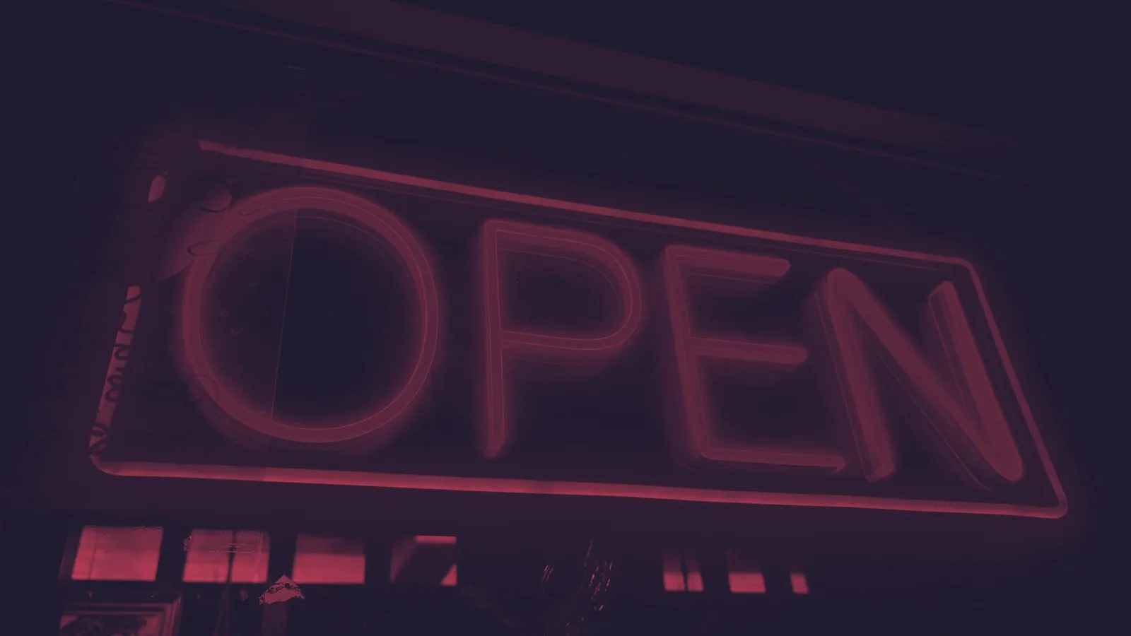
#1A1A2E → #E94560 · PNG export up to 2,000 px on the longest side
How each pixel is recolored
When an image loads, the generator scales it to at most 2,000 pixels on the longest side and computes one brightness value per pixel: 0.2126 × red + 0.7152 × green + 0.0722 × blue, divided by 255. The weights are applied directly to the stored 0–255 values, without gamma linearization. Each output channel is then placed that far along a straight line from the shadow ink to the highlight ink and rounded.
Inks · the default first preset
Shadow #1D3557 · highlight #F1FAEE
Source pixel → output pixel
→ #1D3557→ #8798A3→ #F1FAEE→ #4A5F77→ #B5C2C3→ #2C4362To reproduce this, make a small PNG with blocks of those six colors, load it, and keep the default inks. The table shows why hue disappears: pure green lands close to the highlight, while pure red and pure blue stay near the shadow, because green carries most of the brightness weight. If two important areas of your photo differ only in hue, they can end up as nearly the same duotone color.
- Transparency becomes opaque. Alpha is ignored and every output pixel is fully opaque. Transparent areas are usually stored as black, so they typically turn into the shadow ink.
- Swap and presets. Swap exchanges the two inks, producing an inverted-looking result. The 14 presets only fill the two color inputs; you can edit either ink afterward.
- Export. Download PNG saves exactly what the preview canvas shows, at the scaled size. Nothing is saved between visits.
What is a duotone effect?
Duotone reduces an image to two inks: one color for the shadows, one for the highlights, with everything in between blended along that ramp. Born in print, revived by Spotify's campaign art, it turns any photograph — even a mediocre one — into bold, poster-ready graphics with instant brand consistency. This generator maps each pixel's brightness onto your two chosen colors and exports a PNG of up to 2,000 pixels on the longest side.
How to pick the two colors
A duotone lives or dies on the lightness gap between its two inks, not the hue gap.
- Shadow ink: dark and saturated. Deep navy, plum, forest, near-black brand colors — anything with real darkness. If your shadow ink is a midtone, the whole image turns to mud.
- Highlight ink: near-paper. Cream, pale pink, mint, light gray — something bright enough to read as "light". Pure white works but looks clinical; a slightly tinted highlight is what gives duotones their signature warmth.
- Test the pair as text first. The Contrast Checker uses a different brightness formula from this generator, but it is a useful proxy: a pair with a low ratio usually gives a flat duotone. The default preset
#1D3557/#F1FAEEmeasures 11.56:1; the neon example above,#1A1A2E/#E94560, measures 4.46:1 and relies on the photo’s own contrast. - Steal from your own photo. Run the image through the Palette Extractor, take its darkest and lightest colors, and nudge them toward your brand.
What duotones are actually for
Beyond looking good, duotone solves a real production problem: mismatched photography. Ten photos from ten sources — different lighting, different color casts — become a coherent set the moment they share two inks. That's why the technique owns music posters, event branding, and content thumbnails: it manufactures consistency. It also survives compression beautifully (two-color images have gentle gradients and few surprises) and stays legible for most color-vision deficiencies, since it encodes the image in lightness rather than hue — though it's still worth a pass through the Colorblind Simulator if the two inks are red and green.
Related tools & guides
- Photo Palette Extractor — Not sure which two inks to use? Extract the photo’s own palette first.
- Colorblind Simulator — Check that your two-color pair still reads for color-blind viewers.
- How to choose a color palette — Picking colors that survive being reduced to two.
- What is a duotone? — The design history behind the effect, and how to pick the two inks.
- What movie color palettes teach us — Use a two-color reduction to reveal the value structure underneath a cinematic palette.
Frequently asked questions
How do I choose good duotone colors?
Pick a dark, saturated shadow color and a light, warm highlight — high lightness contrast between the two is what keeps the subject readable. Complementary pairs (try the Harmony generator) give the boldest look; two steps from the same shade scale give the subtlest.
What images work best?
Photos with a clear subject and strong light/dark separation: portraits, architecture, product shots. Flat, evenly lit images produce flat duotones — raise the contrast in an image editor before loading it here.
Is the downloaded PNG full resolution?
The effect is rendered at up to 2000px on the longest side — larger sources are scaled down to keep processing instant. Nothing is uploaded; the whole transform runs in your browser.