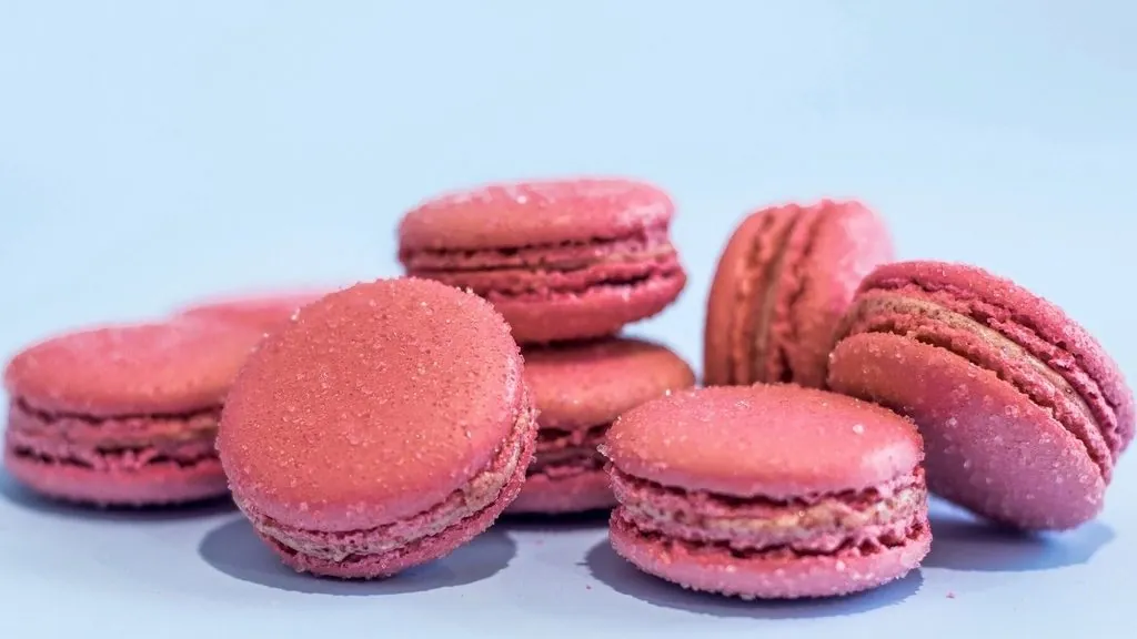
A photo can supply inspiration, but a production palette needs decisions: which colors represent the source, which jobs they perform, how their light and dark variants behave, and whether people can read the final combinations. ScanHue keeps those steps separate so you can measure each one instead of guessing.
1. Choose the kind of evidence
Use the Photo Palette Extractor for a compact summary of an image. It averages groups of sampled pixels and aims to retain contrasting accents, but resizing and filtering can lose tiny details. Use the Image Color Picker when one coordinate matters, such as an opaque logo fill or a product midtone. Extraction describes a scene; an eyedropper reads a browser-decoded pixel. Neither is a substitute for the source file's color specifications.
2. Give every color a role
A row of attractive swatches is not yet a system. Decide which value covers the largest surfaces, which one creates structure, and which scarce accent signals the action that matters. Add a near-white and near-black that share the palette's temperature when the source photo does not provide usable neutrals. The practical photo-to-palette guide shows how to assign those roles, while the 60-30-10 rule explains why unequal coverage produces clearer hierarchy than five colors used at equal strength.
3. Build only the variants you need
Interfaces usually need more than one strength of a hue: a light selected surface, a stable border, a base action, a pressed state, and a deep text color. Generate those candidates with the Shades & Tints Generator, then keep the steps that have a named job. Use the Color Harmony Generator when the system needs a related second hue, and the Color Code Converter when design or code calls for HEX, RGB, HSL, CMYK, or OKLCH. Converting notation does not change the color; adjusting its coordinates does.
4. Verify the combinations that ship
Test actual foreground and background pairs in the Contrast Checker; do not assume a vivid hue or a dark theme creates readable contrast. Then inspect the palette with the Colorblind Simulator and make sure status, selection, and chart meaning also use labels, icons, position, or patterns. Finally, place the colors in a real component rather than judging isolated swatches. A heading, paragraph, button, border, focus state, and error message expose hierarchy problems that a palette strip cannot. The result is a smaller, explainable set of colors with evidence behind every role.